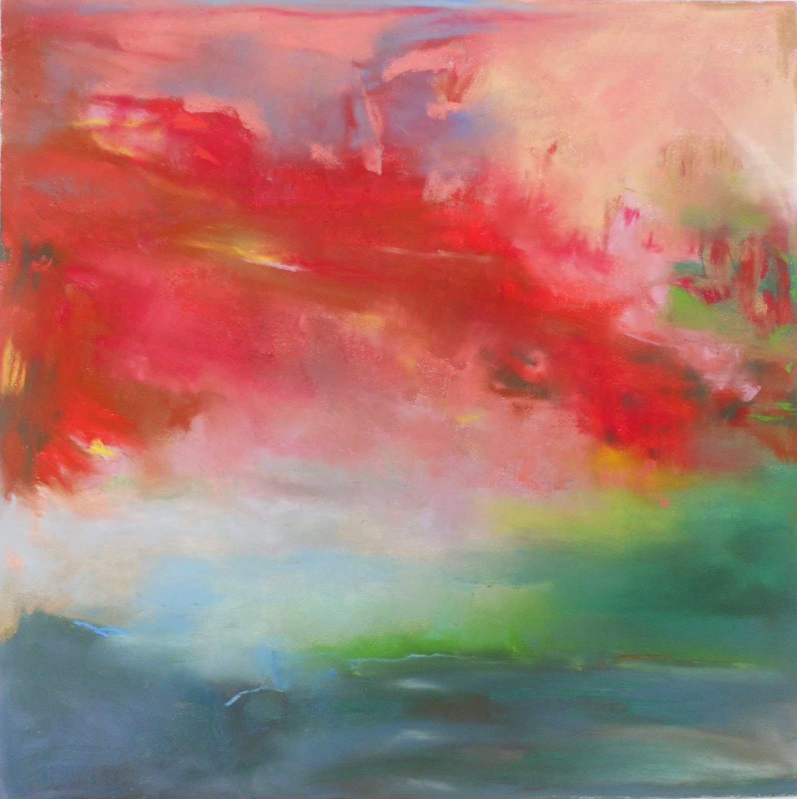
Friday, September 5, 2014

Sabbatical Stories


Love and Time
15" x 15"
Completed Summer 2014
pastel over monoprint

There was so much unexpected about having a sabbatical.  First, having it in the first place.  Then, "what're ya gonna do?"  Then, suddenly it starts.  Then, suddenly it's over.  This is the story of what happened on mine, through pictures of the artwork completed over these 3 months.

The original plan to use the time in my print studio evaporated when I learned that the magnificent Whelan printing press generously on loan in my basement for over 5 years was moving with its owner to New Mexico, ten days after my sabbatical was to begin.

Determined to print as much as I could in the first ten days of the sabbatical, I hadn't figured how tired I'd be from getting ready to leave the gallery for 3 months, and hadn't a clue as to what I'd print.

So, I just printed.  I spent the first day gathering the materials, without an idea in my head. Second day, I started to draw and smush the oily colors around with my latex gloved fingers, not even looking out the window, just remembering scenes, color relationships and effects that had languished in my memory.

Here are a few pictures from the studio, which I particularly appreciate because they were snapped shortly after I got up one morning - no make up, no comb or brush, definitely sloppy clothes, but you can tell how happy I was to be there.


Some 30 monoprints later, I waved goodbye to the press, and within minutes opened an email that released a floodgate of priorities from other sources, ultimately keeping me out of my pastel studio  - where I finish the monoprints - for another month.  So already, . . . the best laid plans got off to a very slow start!

First Day of School


Crowning Glory
monoprint over pastel


That feeling when everything is new, when possibilities abound, when time is on your side, like on the first day of school - that was the feeling when I finally got into my studio.

Stealing a moment from other projects, and stepping into a room filled with blinding light, without an idea in my head yet again, I simply began.  Choosing an unquestionably unfinished monoprint from the pile, I pinned it on the wall, and started drawing into it.  

Whomever was my inspiration that day, I cannot remember, except that I was to look at a great deal of Richard Diebenkorn, Zoem Walter, and Rita and of course, always Helen Frankenthaler, not that any of them would have had anything to do with this image.  The Scottish artist Joan Eardley (1921 - 1963) was a new discovery who provided many "ah-ha" moments.  Perhaps it was a brief visit with the works of J.M.W. Turner that began the first day and what was to come.  That would make sense.

Otherwise, where this came from, I do not know. I just drew into the monoprint, taking my clues and cues from what was happening in front of my very eyes - nothing else.  

After Crowing Glory was finished, it was a few weeks before I got back into the studio to work again, but I visited it often, sneaking in before I went to bed at night, gazing at this single piece, so I could dream about "what next?"

Standing Alone

Of all the works from the Sabbatical monoprint-making charrette, this is the only one that is finished and signed and stands alone as a monoprint.  It was printed twice, as you can see from the positioning of the first run below.  After the second impression was printed, it was not worked into further.  


Positioning the paper with the image of the first run on it.  


This is the plexiglass plate, with the oil stick image on it, and you can see a corner of the page already printed with its first run.  


Positioning the plate on top of the previous image.  


Hmmmmmmm.........

Blues


Landing*
15" x 15"
pastel over monoprint


On Top of the World*
15" x 15"
pastel over monoprint


Wake Me Up Sky
15" x 15"
pastel over monoprint


Day Dreaming
15" x 15"
pastel over monoprint 

It's ironic to realize that while the sky has dominated my work for the last 20 years, the color blue, in all its manifestations, has never dominated my palette (or my wardrobe, a personal note, but one that makes sense to me.)  Though I have drawn many skies, when I look up, I am drawn naturally toward  dramatic times of day when blue is at a minimum.  

At least, not until this summer, was I drawn toward working with the peace in the blue skies that abounded.  You could catch me day dreaming a lot, and this is the evidence.  


Seeing double?  
One was drawn into the original monoprint, and the other was its ghost.  
Can you guess which was which?


Carnival: Moments of Truth

It's carnival season in Vermont, and county fairs abound, providing such a riot of color, sound and opportunity to have a good time.  Sometimes as you go from booth to booth, nothing seems to go together, though you wouldn't pass on any of it. . . . .which brings up these pieces about which I am perplexed.  Here is your opportunity to be an art critic and tell me whether or not these pieces should be included in the series. or not?


Do you see what's "wrong" with this image?  Well, two things as printmaking goes.  The plate was too heavily inked and when printed, it skidded beyond where it had been placed.  You can see the line made by the double impression about 3inches from the top.  

I tried obliterating the line with pastel, but that made it worse, and as much as I loved the shape of the image, and the depth added by that top 3 inches, I reduced the image to this:

Does it work for you?  I'm still not sure, and hence, no title has been given yet.

The other "mistakes" which are incorporated into the image are the stippled marks over the brown shape of the hill.  That too was the result of the plate skidding across the image.  


Raspberry Sky
15 x 15"
pastel over monoprint

Raspberry Sky is one of the few pieces that lost some of its intensity when drawn over.  Though there is definitely a glow coming from the page, I feel its spontaneity was reduced.  It has a name because it is actually very much like a raspberry, sweet and tart at the same time, so I don't want to pass up on its innate irony, but I do wish I had preserved the mountains as they were.    See print (before pastel) in lower right corner.  


Probably the most worked (over-worked?) piece of the lot, this was one of my very favorite pieces in its monoprint stage, but was lacking "something."  (See above, top row, middle image.)  Was that "something" ever found?  Not sure, but dare I admit to rotating this image twice in its development.  This was also one of the most difficult to photograph, and the picture diminishes its intensity.  To keep or not?


Monday, September 1, 2014

When you're hot, you're hot.

Truly, it was a mellow summer, with the unbearable days of heat limited to a few.  It must be recorded, though, that there were a few hours of many afternoons that to be drawing in pastel in a sun filled room was not the coolest experience.  I even turned on a fan one day, and one never turns on a fan when working in pastel.

Does the use of the color red in these pictures express the heat?  Perhaps I say yes because I do not know where else it came from.  I love it though.  I love the strawberry, watermelon, hot pink sunsets and the drinks to match them, and the swirling El Cholo skirts and the frequent flashes of fireworks in the night sky, and all those summertime experiences that can be expressed in the color red.  What else explains the following?

 4th of July
15 x 15"
Pastel over monoprint


Pushing the Color
15 x 15"
Pastel over monoprint


Watermelon Sky
15" x 15"
Pastel over monoprint


Summer Keys
15 x 15"
Pastel over monoprint


Strawberries in the Sky
15" x 15"
Pastel over monoprint


The Horizontals

The long, narrow format of landscape intrigues me, whether vertical or horizontal, especially because it's so difficult not to get lost in the middle!  For the composition to work, its core must stretch to both ends, like the trunk of a tree or a steel beam.  It's always a challenge to "pull off."

It probably doesn't matter that originally, I was planning on working in a long, narrow format all summer, but ultimately was limited to a few pieces begun last Christmas at Vermont Studio Center, and some drawings en plein air, pastels on white paper only, no monoprint.

No matter, here's what resulted.


Fog at My Feet

Sunday, August 31, 2014

Surprised by Fog

The whole experience of Lubac, Maine and Campobello Island, New Brunswick, was surprising and effecting.  On the scene, I was reaching for colors and grasping for concepts that are uncommon in my studio practice.  The shimmering color, the fugitive quality - not only in the permanence, as in an archival quality, but also in what is seen and unseen or seen and then lost quickly.

Once back in Vermont, the effect was as though a veil had been draped over my vision.  This is not to say the brilliance of color had subsided, but rather that the color shimmered next to its closest mates.

Here are three pieces that attempt to capture that quality.  They are drawn over very pale monoprint ghost prints from spring in my studio, ironically that had nothing to do with the ocean side scene when originally printed.  (These are terrible photographs, but will be updated.)


Buttermilk and Fog
15" x 15"
pastel over monoprint


Sorbet and Fog
15" x 15"
pastel over monoprint


Shore and Fog
15" x 15"
pastel over monoprint

Wednesday, August 27, 2014

Eating Stars

One of my favorite lines in A Hundred Foot Journey refers to Gandhi "eating stars."   When I heard it, uttered by Om Puri on the screen, my memory was propelled back to these recently completed pieces in my studio, all of which came out of my head, but were intended to have something of a celestial connotation.

This has been a summer of moons and stars and fireworks and celebrations in the sky, real and human-made.  The sunsets have been dazzling, and the sun rises offered quiet meditations on the power of color to make a day even as it was just beginning.

These 2 pieces began as hurriedly made prints in my studio at home with no idea as to how I was going to follow up on them.  Sometimes those are the best pieces.  They make themselves.


Super Moon
15" x 15"
pastel over monoprint


Dancing Stars
15" x 15"
pastel over monoprint


High Tides

These 16 x 9 pieces began as monoprints last Christmas (2013) in the print studio at Vermont Studio Center.  Along with several other pieces printed that week, they languished in the "unfinished" drawer of my studio for months, only to see the light of day during my 2014 sabbatical.

It is perhaps ironic to say that they each began as simply studies in blue, and came to a conclusion after a week in Lubac, Maine (July, 2014.)  It is as though the monoprints in December anticipated the vacation in July, where the dramatically rising tides and fogs determined the days.

There are a total of 7 of these pieces, of which 6 are shown here.  Titles and in fact better photographs will be forthcoming.


Monday, August 25, 2014

Thursday, April 1, 2010

Prints arive in Madison


The prints arrived in Madison today, and I am elated to share with you an email from Valerie Kazamias, President of the Madison Print Club that commissioned the project. "My God...they are great!!!!Thank you, thank you. I am speechless, they are all so beautiful...WOW. You should be VERY proud. Thanks, Valerie" I am so excited I'm taking tomorrow off from work, and settling down for a long, spring nap.

Tuesday, March 30, 2010

The Last Shall Be First


It's a sign of how tired I am at this point that I'm not even sure I can explain the irony of this piece. It was one of the first I printed, and one of the last into which I drew, bringing the project to 140 images. . . . .but wait a minute, it's not over yet. We still have the trip to Madison to present the series at the Madison Museum of Contemporary Art. There will be lots more to share, so please return to this blog. The above image shows the dimensions of the sheet size - 26" x 20".

12-7-09-7


This was one of the last prints into which I drew.


The scene of the crime


Here is the scene of the crime - the Lahouillier Farm along Route 15 in Johnson. The car is parked in front of what used to be the Painted Caravan, my friend Isabeth Hardy's former studio and gallery. That was the scene where I was practicing my printing on Isabeth's Whelan Press, and where I realized the MYSTIQUE of the Sterling Ridge, which is now immortalized in the Lamoille Project. In this picture, Howard has captured it as it was - my sitting in the passenger seat, with the oil sticks spread out on the driver's seat, preparing the plates.

Packing the prints


Friend Paul Gruhler came over on Sunday to help me wrap and package 120 pieces to be shipped off to Madison. It took us over 6 hours, and here is all the work, piled up on tables in the living room. Now maybe I can have my living room back!


Helen Does Inventory


My friend Helen Lewis came over on Saturday to help with the inventory of the prints = 140 minus the 20 I'm keeping for myself equals what? We went over and over and over every single piece, to make sure they were all accounted for. Without a doubt, Helen counts better than I do!


Shipping

I've just returned from shipping 120 pastel monoprints to Madison, Wisconsin, bringing this 3 year project close to its conclusion. It must feel like sending your kid off to college, though there is still a great deal to be done. . . . . including posting the entire series in the glory of its completion, writing the presentation speech, selecting the images for projection, and CELEBRATING! Anyone who wants to celebrate this momentous occasion with me, come'on down, and please return to this blog soon to see the conclusion of the project, and notes about the presentation.

Sunday, March 7, 2010

12-29-08-3


I had not expected to be drawing this weekend. In fact, I thought the drawing phase of the project was finished until yesterday when I counted the number of finished pieces, and came up 9 short. Let's not speculate as to how that happened, except to say, I'm glad it did. In the last day and a half, some of my very favorite images in the entire series resulted. What a high on which to conclude the project.

12-29-08-4


What a surprise this piece turns out to be. Originally a "ghost" and pretty weak looking - it gives evidence to what I cherish about this process. The ghost gives clues to a reality far more complex than what I drew on the plate.